Patients don't arrive at your pharmacy website to browse - they arrive with a purpose. They need to book a service, find out if you offer a specific treatment, or get in touch with a pharmacist quickly. If your website makes that difficult, you've already lost them.
Clarity Is the Starting Point
The single biggest thing a pharmacy website can do right is make its services crystal clear. Not buried in a dropdown. Not hidden behind a generic "What We Do" page. Right there, front and centre, the moment a patient lands on your site. Patients need to immediately understand what you offer, whether you can help them, and how to take the next step.
"If a patient has to look around for more than five seconds to find what they need, that's a friction point - and friction costs you bookings."
The Patient Journey Should Be Seamless
Think about what a patient actually needs to do: land on your site, understand your services, book an appointment or get in touch, and receive confirmation. That entire process should feel effortless - no confusion, no dead ends, no unnecessary steps.
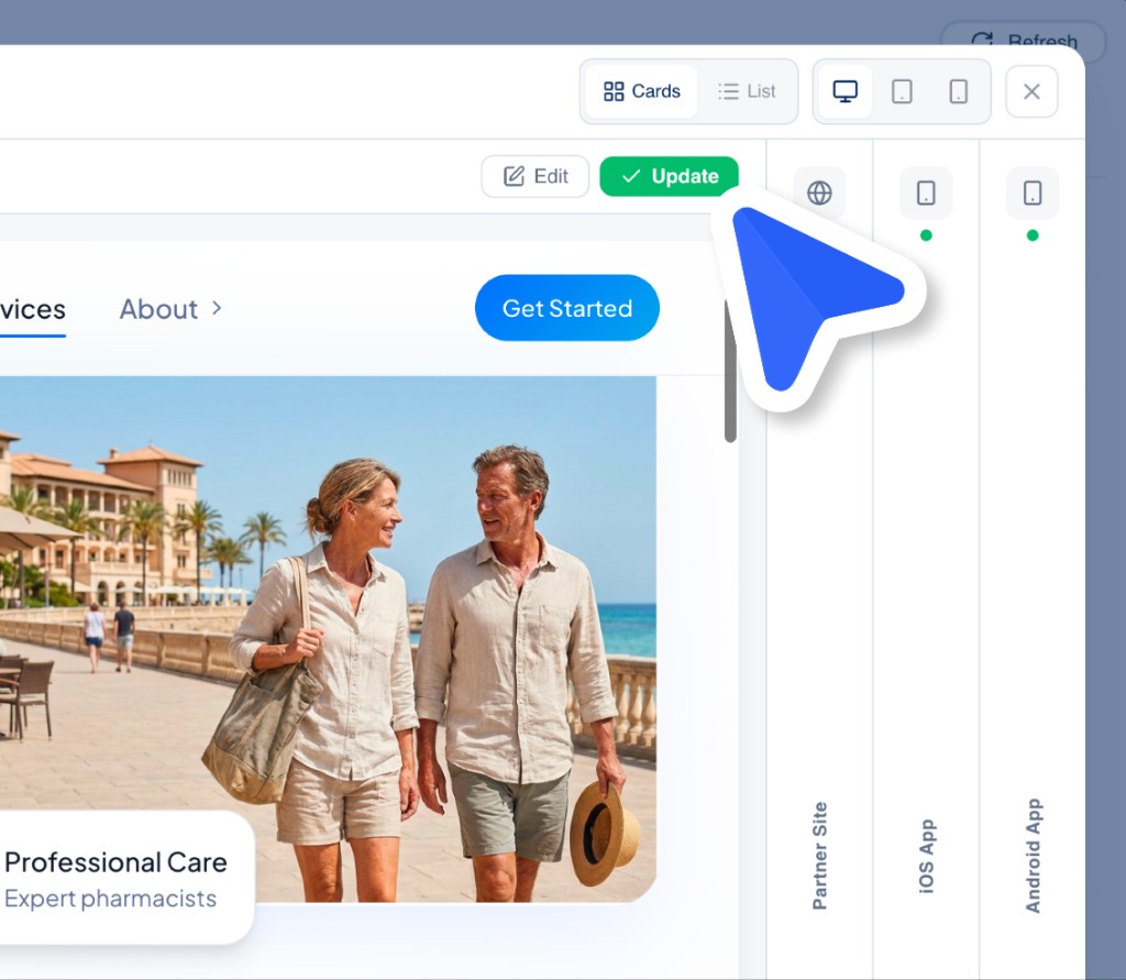
- Services are visible from the homepage, not hidden in menus
- Booking flows are short, intuitive, and mobile-friendly
- Contact options are easy to find - phone, message, or callback
- Clear confirmation keeps patients informed every step of the way
Great SEO Brings Patients to the Door
A frictionless experience starts before the patient even reaches your site. If your pharmacy isn't showing up when someone searches "travel vaccines near me" or "blood pressure check in [your town]", you're invisible. Strong, localised SEO ensures your services are discoverable - so the right patients find you at the right moment, when they need you most.
Accessibility Is Not Optional
Pharmacies serve everyone - including elderly patients, those with visual impairments, and patients with limited tech confidence. Your website must meet accessibility standards: clear font sizes, sufficient colour contrast, screen reader compatibility, and intuitive navigation. Accessibility isn't a box-ticking exercise; it's how you ensure no patient is left behind.
CTAs That Convert
Every page on your website should guide the patient towards an action. A clear, well-placed call-to-action - "Book Now", "Check Availability", "Speak to a Pharmacist" - removes ambiguity and drives patients forward in their journey. Weak or vague CTAs are one of the most common reasons pharmacy websites lose bookings they should have won.
"Good design isn't decoration. It's the difference between a patient completing a booking and leaving your site to find a competitor."
At PharmAppy, we build pharmacy websites and patient-facing tools that are designed around this principle from day one - because for pharmacies, every friction point is a missed opportunity to deliver real care.